 This week we did a sketchup project and we made a house. This project was very hard but super fun. We first made the dimensions of the house and used the rectangle tool and push up tool to make it 3D. The we made the roof after that. Then we did the gutters windows and doors. Then we used 3D warehouse and inputed some trees and cars into our design. It was a very fun project and i hope to of it again.
Monday, December 19, 2016
sketchup design
This week we did a sketchup project and we made a house. This project was very hard but super fun. We first made the dimensions of the house and used the rectangle tool and push up tool to make it 3D. The we made the roof after that. Then we did the gutters windows and doors. Then we used 3D warehouse and inputed some trees and cars into our design. It was a very fun project and i hope to of it again.
Q2 Reflection
1. What are your areas of strength in the content areas that you learned this
semester (animation, graphic design or video)? The area that is my strength is graphic design.
2. What are your areas in need of improvement? I need to improve in animation and improve my skills.
3. What did you love most about this semester? I loved being in class and doing projects instead of hw.
4. What would you change or do differently? I would change how i did my projects and do them more thoroughly.
5. What is your overall take-away or learning from this semester? I learned a lot of things in graphic design and animation.
6. What’s one goal you would like to set for next semester? Final thoughts? I would set a goal and it would be do the best i can in video and in Q4. This was an overall fun semester.
Web Design Project Blog
The Process
This was web project was our ecomm final that took a whole week. First we watched Mr. Olsens videos and followed along in dreamweaver. We set up dreamweaver so it had our websites in it. Then we made links so it would send the user directly to chrome or safari. We finished it off by putting everything in there and make the color fancy.
What is new?
Using dreamweaver is brand new for me. We have never used it before. It was very fun for me and wish to do it again. It was very complex and hard but i got it done.
Takeaway
I learned how to use certain features in dreamweaver and learned how to link websites. I learned to watch videos and listen to instructions. I faced many challenges and overcame to finish the project.
Friday, November 18, 2016
I'm an ONW student with an interest in athletic training. My friends and teachers compliment me on my responsibility and organization. I'm looking for advice on how i can put myself in a role that would improve my training abilities. I'm a responsible young man that strives for bigger and better. I want to use my skills to help the people around me that are seeking help.
Wednesday, November 16, 2016
My Ten Strengths
The Process
First, we had to pick 10 words that describes us. The we put it in photo shop and arranges it in a cool formation. We used different fonts and sizes to make it look even cooler. Then we used the timeline in photo shop to make the words animated on the screen. Then we published it on our youtube channel.
What is new?
Learning about the video timeline and making a youtube video was new. The youtube was very confusing but I figured it out and got it published.
Takeaway
I will take away what I learned in youtube and what I learned in the actually animation.
Monday, November 7, 2016
Arcs Animation

The Process
First we made the layers like the sky, ground, and the ball. Then I copied the ball in an arch movement. As the ball hit the ground, I switched the ball to the sad face. And then, I made the ball roll of the screen. The title fades out into the actual animation at the beginning and fades out at the beginning.
What I learned
I learned how to do an arch line. I learned how to make copies of layers and transform them. I also learned how to use squash and stretch while transforming.
Wednesday, October 26, 2016
Bouncing Ball
Bouncing Ball
The Process
In class we learned how to squash and stretch and the basic principles of animation. We made a background the first day, then we made the ball, then we made the actual animation. We learned shortcuts and where everything is located. We made the ball stretch on the way down and squashed when it hit the ground. We then saved it as a GIF and saved it to the server.
What Did I Learn
I learned the basic principles of animation. I also learned shortcuts and where basic things are located in photoshop. We mostly learned squash and stretch and how to transform it into the desired shape.
What Would I Do Differently
Next time, I would add more ball images and make it more realistic. I would also make the squash and stretch more detailed as well. I'd make the frames more close to together and then when it times come to the bottom, then I'd make it more spaced out.

Tuesday, October 18, 2016
Social Media Blog
Yesterday in class we read an article about social media posts and how your media isn't private. Some colleges check student media if they are having a hard time picking applicants. This determines the picking process if the student has bad social media. Sometimes athletes and smart students can not get in to colleges because they have nasty media on their profile. Once something is on your profile, its very hard to take off. We, as a class, marked up the text and put down any questions we had about the text. We then discussed this as a class and gave feedback on the article and pointed out any key things. This really stood out to me because it shows this can narrow down the process of picking applicants.
Friday, October 7, 2016
Handwriting Blog

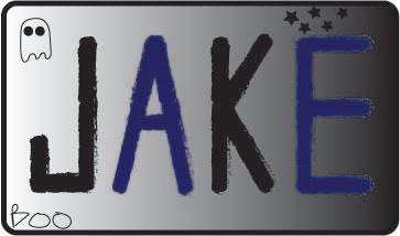
This week in e9, we did a name logo project. My name logo project went very well. I think that the final product turned out to be really good. I used the curved rectangle tool to make it look more fancy. Then used dark colors and added a fun little ghost to make it look a little halloween themed. This project wasn't that hard for me because I got the hang of it really quick after the J. This name logo was fun and easy for me and i hope we do more things like this.
We also did a handwriting sketchbook assignment this week. This described our personality and how we perceived our name. My 10 traits that I chose were happy, athletic, funny, quiet, smart, joyful, loving, kind, stressed, and weird. Then I chose 3 fonts to write my name in. I chose a cool design that looks like swirls. Then i chose 2 other fonts that show creativeness. I especially like the first one because I think it looks cool. This Sketchbook assignment showed our personality traits and how we write our names.
Friday, September 23, 2016
Presentation Skills Blog
Everyone needs presenting skills so they can be successful in presenting in front of an audience. One presentation skill is how you speak. You have to speak at a good pace and loud enough so everyone can hear you. Another presentation skill is the content you are presenting. The content needs to be long and thought out. The third and last component of having a good presentation is rehearsal. This is important so you can go through it quick and easy and you don't have words like um or so.
The TED videos showed us how presenting should be. It showed good presenting skills and what a good presentation should look like. Bill Gates showed a good presentation when he was speaking at TED. I gave him three fours and one five. Lomberg gave a really good speech but his appearance wasn't all that great. Jamie Oliver's speech wasn't as good but he got his point across to the audience. TED speakers are very good at presentation skills.
My presentation went pretty good for our first e9 presentation. I had good eye contact and a loud voice. My content wasn't very good. I could've added more so my presentation would be longer but overall it went well for the first time. I will prepare more for the next time we present and do the best I can.
Friday, September 16, 2016
The sketchbook
 My sketch is just a normal sketch, nothing to fancy. I used a font for the graphic design letters in the middle of the page. Then I drew two sides to it, the sunny side and the dark side. I used pictures off the internet to inspire my design. Theres no logos but there is basic sketches of a sun and a cloud. I like how theres two sides represented in my sketch and it looks very cartoonish. This assignment was quite easy and very fun because I like drawing.
Wednesday, September 7, 2016
Thinking About Color
 Blue is my favorite color because it represents peace and calmness. Blue represents police and things that help people. Ive always liked the color blue because its the color of some of my favorite sport teams like the KC Royals, Chelsea, or even ONW Ravens. I would change my car color to like a dark chrome blue if I could. My color is both bright and dark because it could be a darker tint or a lighter tint. But most of the time it is a shade.
My least favorite color is brown because its just a nasty color. Its the color of my house which i lived in all my life and its quite boring. Brown is widely used for houses and buildings all the time. Theres just no color to brown and its just a dull color. Brown can be a tint but usually its a dull shade.
Friday, September 2, 2016
Illustrator Experience
My illustrator experience went quite well. I used the rectangle tool to draw 5 shapes. I changed the rectangle to an ellipse tool, then into other shape tools. The graphic design I made was a house just like a real house that people would live in. This graphic design came from my imagination and creativity as well as my personality. This fits my personality because it shows creativity and a lot of small details some one else might've missed. My personality is very well creativity along with organized because i don't like things being off center or weird looking.
We also learned about color theory in class on Monday. It showed that colors are primaries and secondaries. There are also tertiary and analogous colors. We learned by using doe color wheel and looking at all the shades and tints of the color wheel. It is a really good tool to use if you ever have questions about the color wheel.


We also learned about color theory in class on Monday. It showed that colors are primaries and secondaries. There are also tertiary and analogous colors. We learned by using doe color wheel and looking at all the shades and tints of the color wheel. It is a really good tool to use if you ever have questions about the color wheel.
Thursday, September 1, 2016
Sidewalk Chalk Activity
Sidewalk Chalk Activity

My group used a lot go collaboration on this sidewalk chalk. We first chose what symbols we represented on the sheet that was handed out to us. Then we sketched our idea onto a paper that we were soon to put on sidewalk. We communicated when it was time to start using the chalk so we can get thing done more efficiently. We chose the colors that represented us the most and we came up with really creative symbols we would draw on our flag. We got the job done and I think our flag turned out just great.

The team experience was very collaborative and made us communicate with people we might not know. It was a fun timed the chalk project went great. If we did it another time, I would make sure more people communicated and contributed more so our flag would have been even better.
Subscribe to:
Comments (Atom)